SketchUp File:https://3dwarehouse.sketchup.com/model/7d21178c-64f0-42cb-b3d3-ee79e78b74ef/ARCH1101-Experiment-3-Submission
Thursday, 22 June 2017
Wednesday, 21 June 2017
Experiment 3 - Final Images
Sydney's sunny climate with mild winters and warm summers is the perfect choice for architecture with large windows, balconies and lightwell, which means more natural lighting and open space for people who interact with the building.
Inspirations:
Walsh House - Glenn Murcutt
Unknown Architect
Tuesday, 20 June 2017
Experiment 3 - Two Moving Elements
Solar Panel Roof
UNSW is famous for solar panel research and development. There are many solar panels on the rooftop of most faculty buildings. We get lots of sunshine here in Sydney and we can use this source of renewable energy to reduce pollution from traditional power plants.
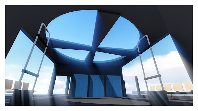
Rotational Skylight
The rotational skylight is located on the 3rd level above the staircase. It provides extra lighting to the stair section and the common area creating an open space.
Tuesday, 30 May 2017
Thursday, 25 May 2017
Experiment 3 - 36 Textures
TEXTURES APPLIED IN MODEL:
TEXTURES IMAGES IN MODEL:
The rotational texture is applied to the ceiling of the round computer lab.
Teaching, in some way, is a scalar movement.
Another rotational texture is applied to the outdoor balcony. The balcony is a place for people to socialise and expand their social circle. Human interaction can be rotational, each individual is the centre of a rotation, like our galaxy.
Friday, 19 May 2017
Experiment 3 - The Plans and Design Process
2D Draft Section
A helpful source of this site analysis:
Developing the 2D Plan
LEVEL 1
LEVEL 2
LEVEL 3
3D Form
Developing the Sketchup Model
How I developed the 3D SketchUp model:
Based on Wk3's task we were asked to study a plan and then develop it into a section for our project. (See 2D Draft Section) This is the starting point as Point A.
We were also asked to visit the site at lower campus near the Roundhouse and do a Site Analysis (See Site Analysis). A 2D shape is later developed based on the site analysis (See Developing the 2D Plan). This is the starting point as Point B.
Using both Point A and B, the model then is developed in SketchUp (See 3D Form)
Why the blocks with large windows?
There are mainly two reasons.
The first reason: I was amazed by Louis Barragan's work and his design style while preparing for our last project - Experiment 2. He extensively used right angles and rectangular shapes in his architecture, which made me realise that you don't have to use fancy shapes and organic curves to design a beautiful architecture, sometimes you can get amazing results by playing around with basic and simple shapes.
In fact, when I first looked at the brief of Experiment 3 I was considering using Rhino, a powerful modelling software that can generate all sorts of 3D shapes and beautiful curves, also a software widely used by those HD students. But I changed my mind when I was developing my theory out of 3 words from Wk1's task.
And this leads to my second reason: the design theory.
In my design theory, I suggested that architecture should fit into the culture background of the city and the country, creating a sense of belonging to the people. And later when I was doing some research on Australian architecture I came across with the story of a famous Australian architect - Glenn Murcutt, who only design his work in Australia and nowhere else. He insisted that extraordinary architecture emerges only from a profound grasp of climate, culture and environment. So I looked at his work and studied his design style. Inspired by Ludwig Mies van der Rohe, he used large windows and rectangular frame in many of his design work. That is also the reason why I chose Mies's plan of the Brick Country House to develop into a section. Glenn's design style becomes the Point C of my design for the experiment 3.
Walsh House - by Glenn Murcutt
The round computer lab:
Being the only part of the architecture that is not rectangular, the round computer lab and the spiral frame structure design were inspired by the basic elements of the Roundhouse. The architecture hovers above the Roundhouse, although not physically connected, are joined together.Wednesday, 10 May 2017
Subscribe to:
Comments (Atom)


